Taking notes at AlphaSense
Process
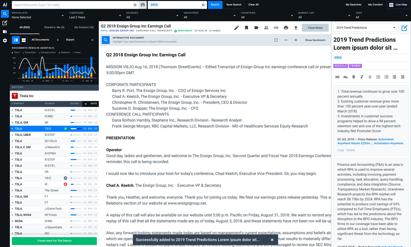
AlphaSense is an AI-powered search engine that helps individuals search and find financial documents and derive insights faster. I inherited this project from another designer and identified key blockers in the experience prior to launch. I redesigned the Note feature entirely: I created new mockups, screen flows and completed two rounds of usability testing prior to launching the feature in September 2019.
I worked closely with my PM and engineering team to ensure a smooth launch and feature that seamlessly integrates itself into users' workflows. I remained in constant communication with my engineering team, who are based out of the AlphaSense Helsinki office, on a daily basis. I made the case and pushed hard for usability testing, as we were launching a net-new feature into the platform and wanted to make sure we were creating a positive user experience for our user base.
Pain Point
TL;DR: Users were turning to other tools or hacky workarounds in order to accomplish two things: to take notes on something important and easily navigate to those notes at a later time.
AlphaSense users love the platform for the wide variety of content and the time it saves them during the day. Over time, we noticed that users were taking notes on the documents they would find in AlphaSense, but there was no easy way for users to take notes in-app.
Users' note-taking workarounds:
- Copy + paste text from a document in AlphaSense into a Word Doc
- Download the document and mark up text in Word
- Use Evernote or other note taking apps outside of AlphaSense and have it open side-by-side on a second monitor
We realized that in order to help our users, we'd need to create an in-app notes feature so users could reduce the amount of time they spent going back and forth between AlphaSense and other tools. We needed to allow users to take notes side-by-side next to a document, but also create a space where users can spend time curating their analyses.
Usability Testing
Since I inherited this project from another designer, we were only a few weeks away from launch. I outlined a few different blockers in the user flow that would prevent high feature adoption. Presenting my case to the Head of Product, I pushed to delay launch and conduct usability testing to improve the UX. I ended up conducting 2 rounds of usability testing prior to launching the feature. I ran the first usability tests ever at AlphaSense in June 2019 and one month later, we completed our second round of testing to make sure we resolved any pain points from the first round and that we'd tidied up the experience. After completing the second round, I compiled my findings in a deck and presented them to the Product team in August 2020.
Since usability testing was new for the team, I invited my PM, scrum master and engineers to listen in on my sessions. My PM attended all sessions with me and we always had at least one other listener.
Round 1

I inherited these designs from another designer on the team. I spent my first 2 weeks at the company auditing the Notebook experience and identifying pain points off the bat. I knew that by testing the existing designs sooner rather than later, we would resolve questions that had been so far left unanswered. I conducted the first round in early June 2019.

Round 1 results:
TL;DR: While all participants successfully created a Note, users struggled to find their Notes, edit them side-by-side with a document, etc. Every part of the experience was a challenge.
- 5/5 users successfully created a Note and added content to it
- 3/5 users could not find the side-by-side Note Panel. The 2 users who did find it, did not know how to close it as the button color changed from green to red.
- 4/5 users did not understand how to organize their Notes into Notebooks
- 5/5 users found the default Note title "Untitled Note" confusing and could not initially find the Note they had created as a result
Updates made for round 2:
- Hide Notebooks (organization component) until we have a better understanding of how users want to organize and group their individual Notes
- Expand Intercom Tour to educate users on how to use the Notes feature
- Add a 'Create New Note' modal that allows users to name their Note
- Add a toast message that communicates to users they successfully added content to a new or existing Note
- Change Show Notes to My Notes
- Move My Notes button to Doc Viewer Icon Row (we chose this placement because users would immediately look in the Doc Viewer Icon Row when tasked with finding the side-by-side Note feature)
Round 2

We removed the Notebook component to relieve the pain point users experienced when trying to organize Notes. We descoped sharing a Note with other users as well to ensure that our engineering team would be able to focus on bug fixes prior to usability testing and to smooth out the Note roadmap.
We saw that users in this round struggled to create a Note. Users can create a Note by selecting text with their mouse and then selecting the Note button from the controls that appear. We updated these buttons and added additional context for users so they understand what each button does after selecting text.

Results
- 3/5 users either highlighted or commented on text, thinking it was a Note. This led us to realize that users' idea of a note is different than the originally scoped feature
- 2/5 users right clicked on text to copy and paste the text into a Note
- 4/5 users were really excited about Notes, as their workflow at the time involved copy and pasting text into a Word Document
Additional update for launch:
- Make text formatting controls surface level, as users did not notice them at all and asked how to add bullet points, bold font, etc
Result
This feature soft launched 09/2019 and quickly became a favorite for many users. The simplified UX allowed users too more seamlessly take notes and share them with coworkers, speeding up their workflows.
Deliverables
- Usability testing debrief deck
- User flows
- Mockups
Outcomes
- The Note feature was highly adopted - within the first month, over 1k Notes were created
- This was the first feature launch to ever have undergone usability testing at AlphaSense - while I focused on creating a better UX for our users, I also opened the door my product and engineering partners to learn more about our users and their needs, values, etc. Notably, my engineers started asking why we didn't usability test more often, and could we test everything moving forward?
