Usability at Attentive

Process
Pain point
Journeys (automated messaging) are a marketer's best friend because they are always running in the background and as many marketers said to me in research, "Journeys makes me money in my sleep." This passive income for businesses is a standard practice, but our interface made it challenging for users to create rich and natural automated experiences. We also knew that CSMs took on a lot of the legwork setting up complex journeys and in order to grow as a business, we needed to free up their time for other responsibilities and make journeys more self-service.
The journeys logic builder had many complexities to it - it was not easy to use and there were many blockers users got used to. Here's a snippet of some of those:

Getting it funded
Initially, my PM and I were supposed to tackle a separate project on improving testing journeys. However, we knew that with all the new features and functionality we would add in 2020, the journeys experience would become more and more complex, making it less-user friendly. My PM and I made the business case to instead pivot to a pure usability project focused on enhancing the core journeys experiences: creating a journey and making it easier to edit and manage. We easily convinced our team EM and engineers to get on board and then presented our case to Design, Product and Engineering leadership. We planned on focusing on low hanging fruit alongside our original testing project, but once we updated our roadmap with leadership's blessing, we expanded the scope to be a full deep dive of a Design & Content Strategy overhaul.
Our business goal: By removing blockers and making journeys more self-service, we can a) increase the number of journeys (more journeys = more $$$ for everyone) and b) reduce time spent by CSMs creating repetitive journeys for users
It took a village
This part right here is a public shoutout, love letter and the biggest high five to everyone that touched this project. I could not have done this without the unwavering trust and support from my PM and content strategist - the three of us were unit and we worked together so seamlessly. One of my directs also jumped in to make sure I could keep moving quickly and she was able to level up some new skills as a new product designer too. My engineers were absolute rockstars - I loved getting their feedback and drawing inspiration from them. They encouraged me to push the boundaries and we thought of every possible variation state together. My UX Researcher who worked so quickly to support us in our final weeks with usability testing and helping us identify how to measure for usability success. To the UX team, who gave me so much good feedback and cheered me on.
Weekly rapid prototyping
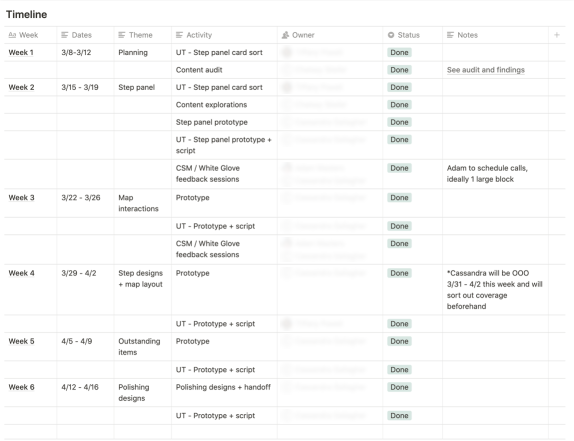
I took a few weeks to flesh out design direction and ensure we were addressing all core usability issues before embarking on 6 weeks of weekly rapid prototyping and testing. It was a wild ride, but wow, we learned so much.
I pulled in one of my direct reports to assist in the first week to do some card sorting on our step panel IA because this project was a monumental effort and I knew I needed support to bring it to the fidelity level I wanted. We were all so incredibly proud of all the collaboration and hard work that went into it.
In weeks 2 + 3, we leveraged internal users (support teams, CSMs, etc) to ensure we were on the right path and identify any red flags with the usability overhaul.
Did I mention I moved back to NYC after a year away during week 4? One of my directs jumped in to support while I unpacked a lot of boxes.
For weeks 5 + 6, we coordinated with our UX Researcher on UserTesting so we could run unmoderated sessions and move quickly while approaching our April 16 deadline.


Result

Rollout strategy
- Phase 1: updated steps panel with new IA and tool tip interaction
- Phase 2: all journey builder updates, aka, literally everything else
Success metrics
- How do you measure for usability success? We ran a study on UserLeap to identify our baseline metrics and set goals post launch